High School Enrollment Campaign: Guide, Folder, and Invitation
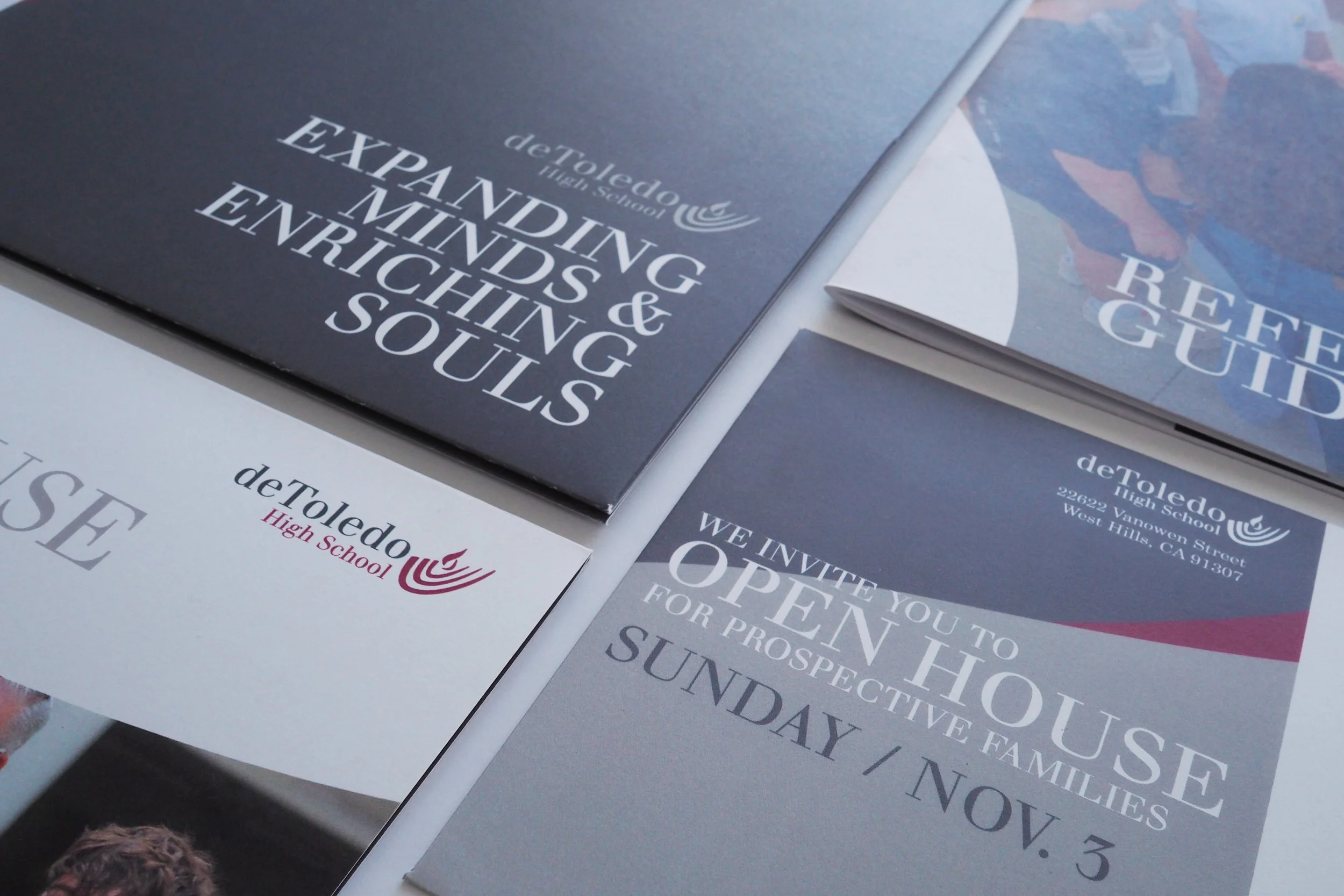
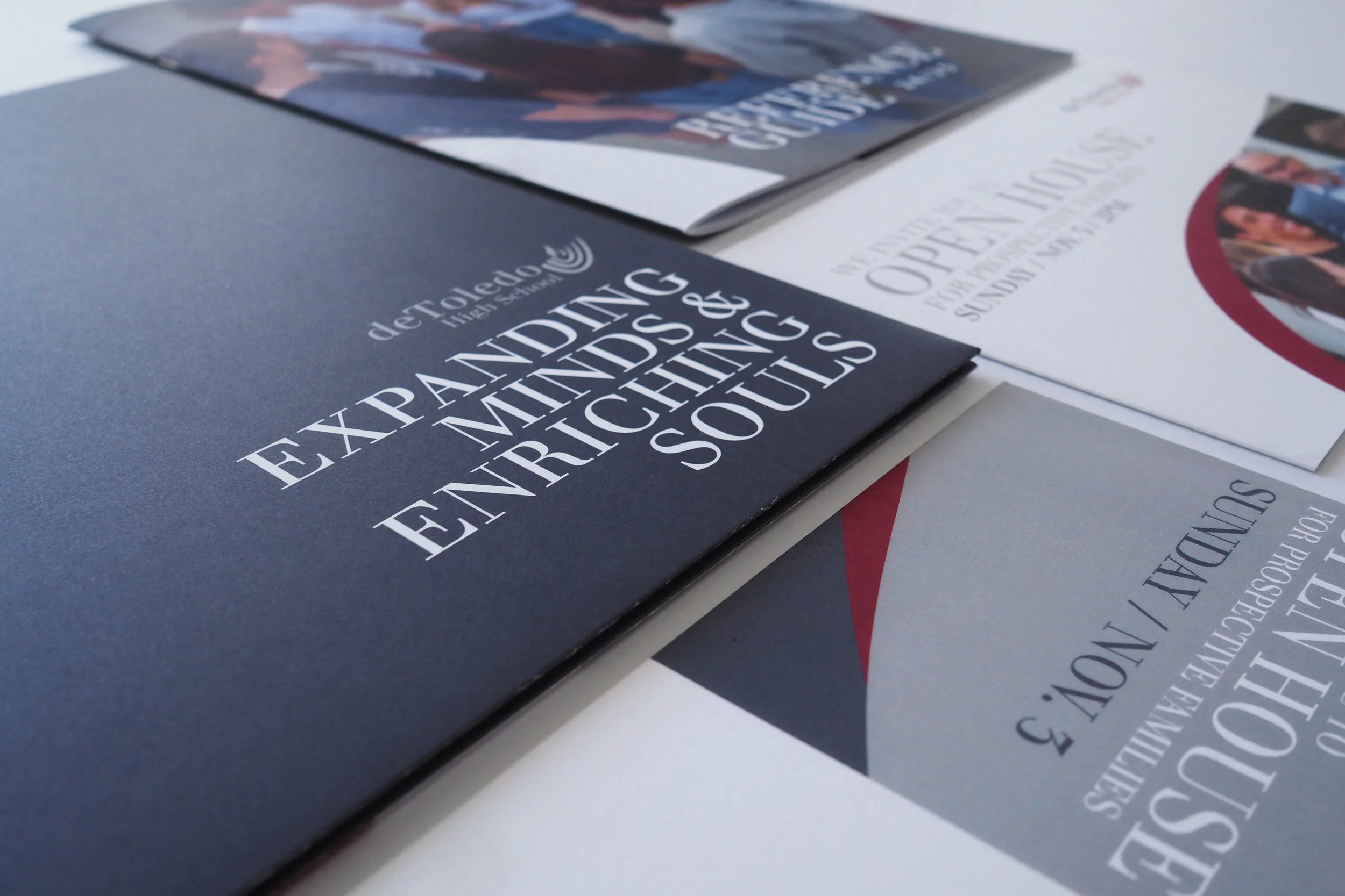
When I began working with de Toledo High School, I was tasked with elevating the private school's brand and creating a more cohesive visual identity. One of the first things I did was look to the abstracted menorah in the school's logo for inspiration. Its organic forms became the foundation for a new visual language, leading me to develop the "flame" motif—a recurring graphic element that I carried throughout nearly every piece representing the school.
Created for de Toledo High School.
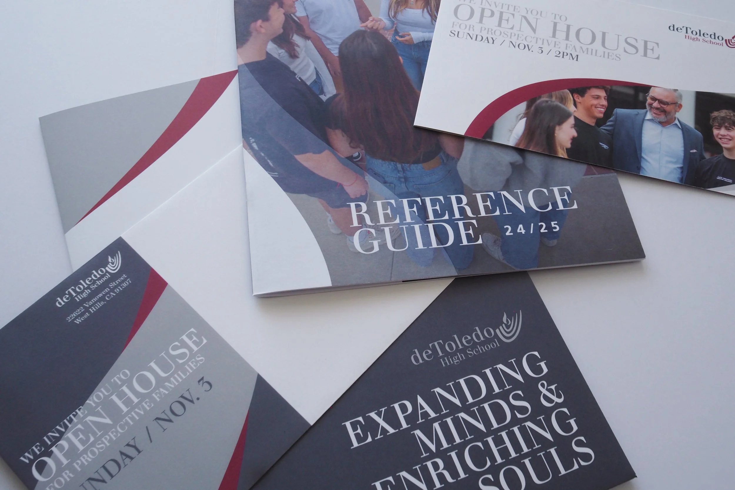
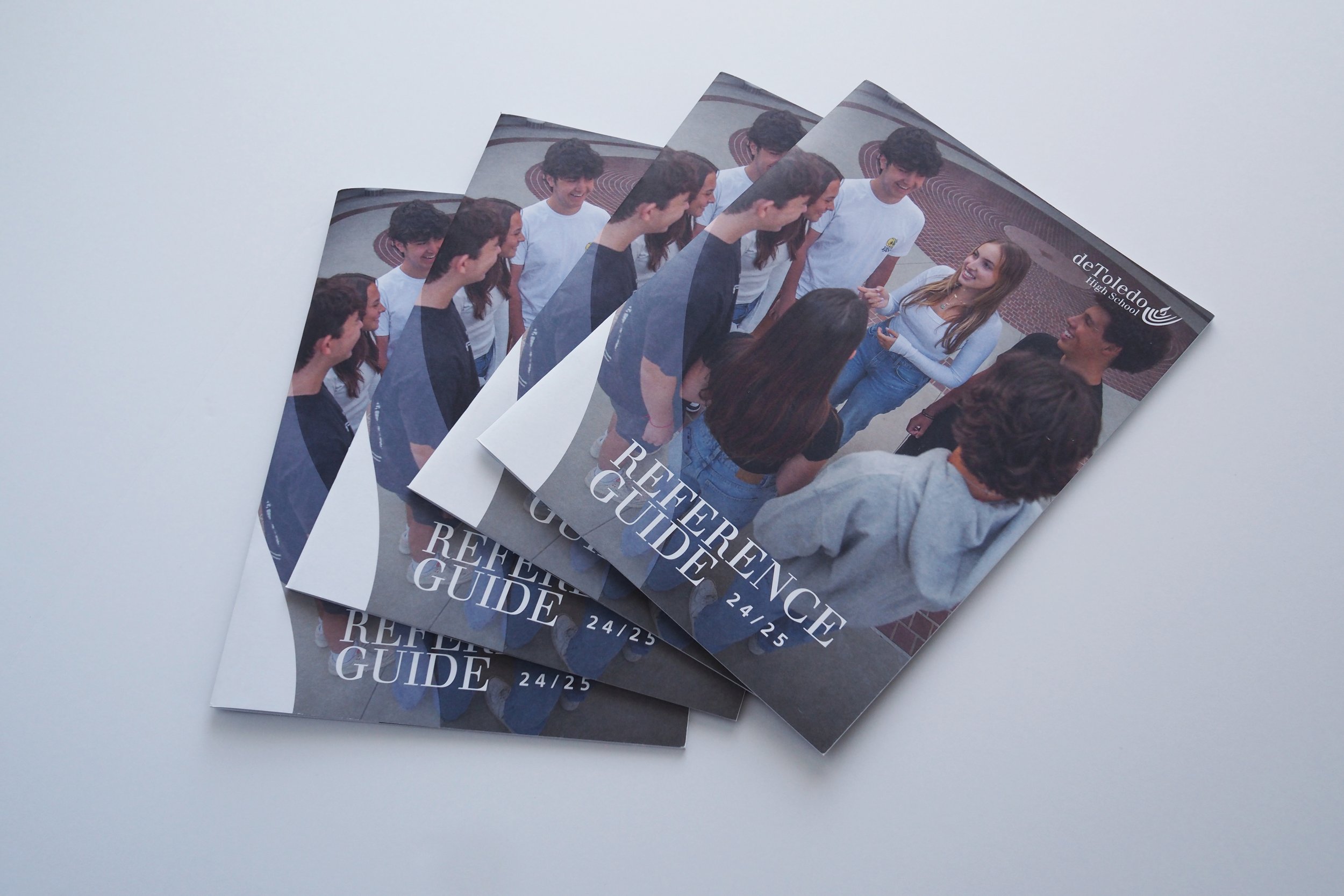
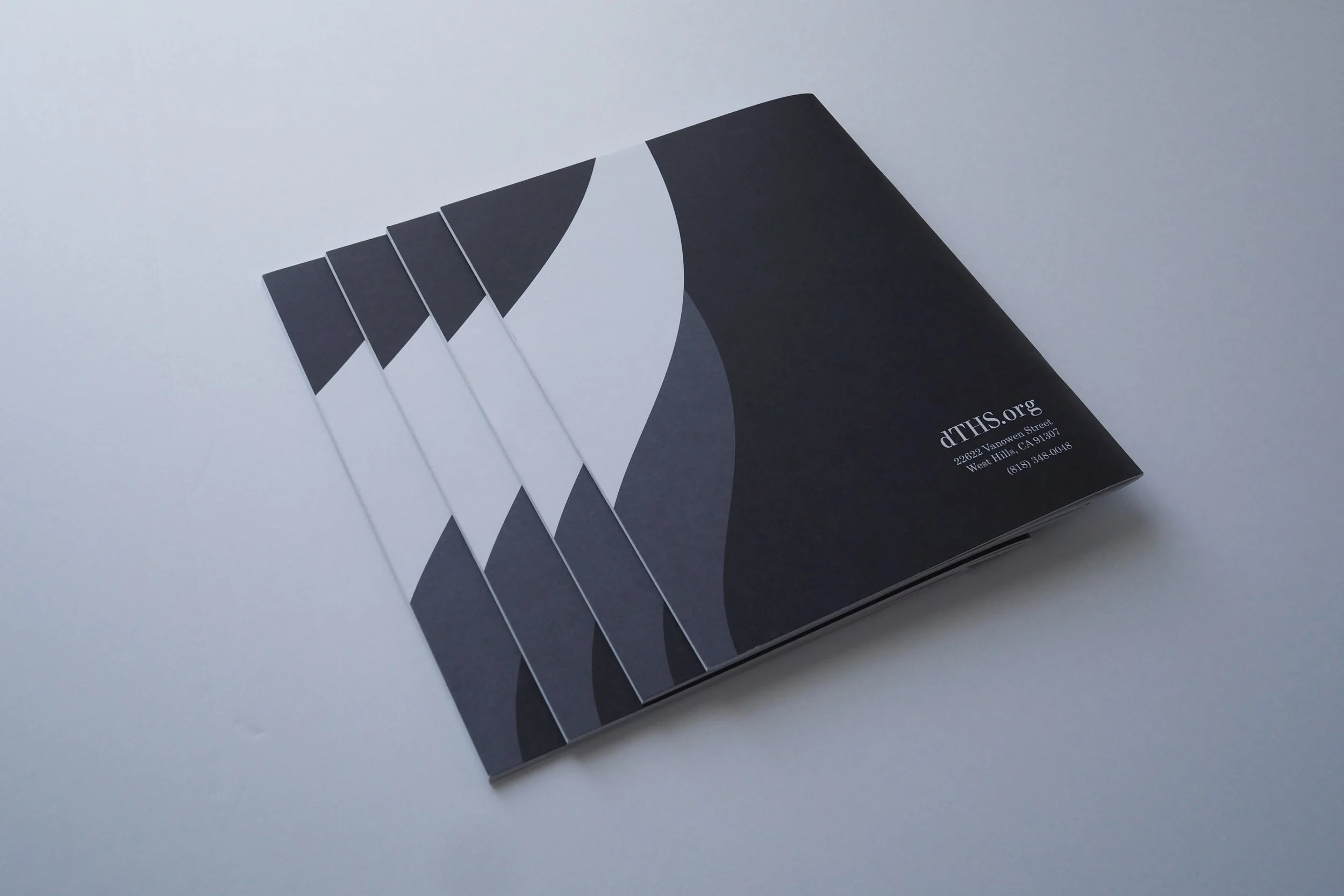
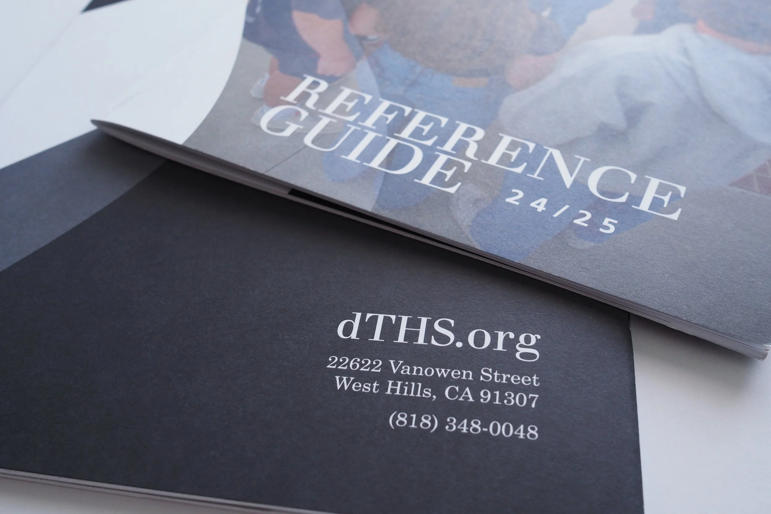
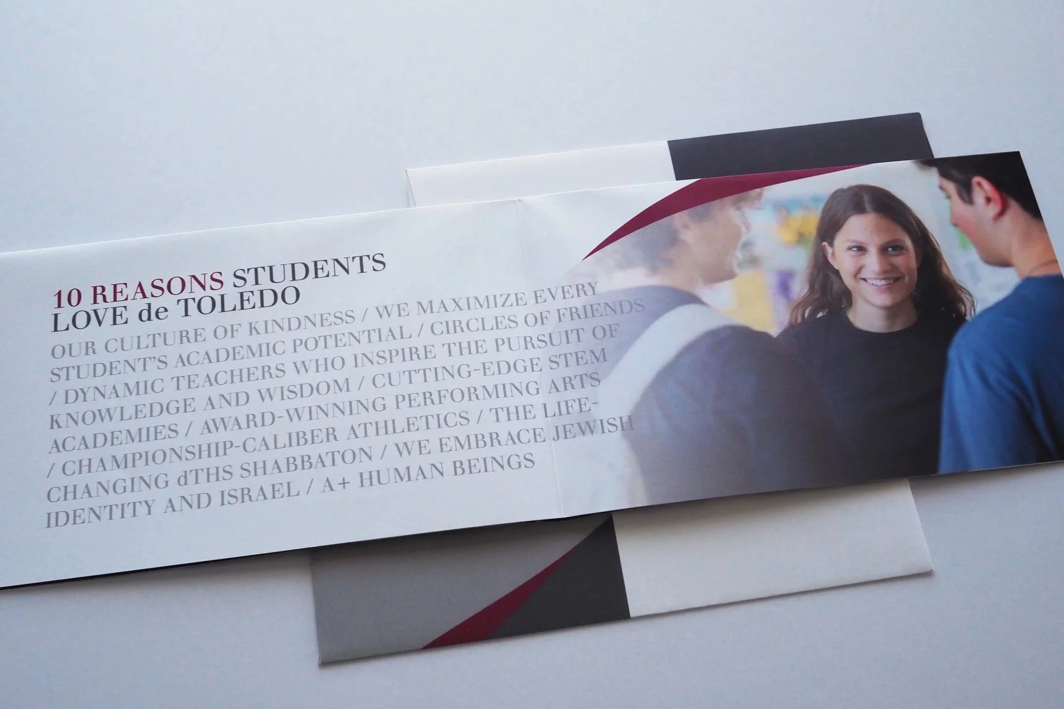
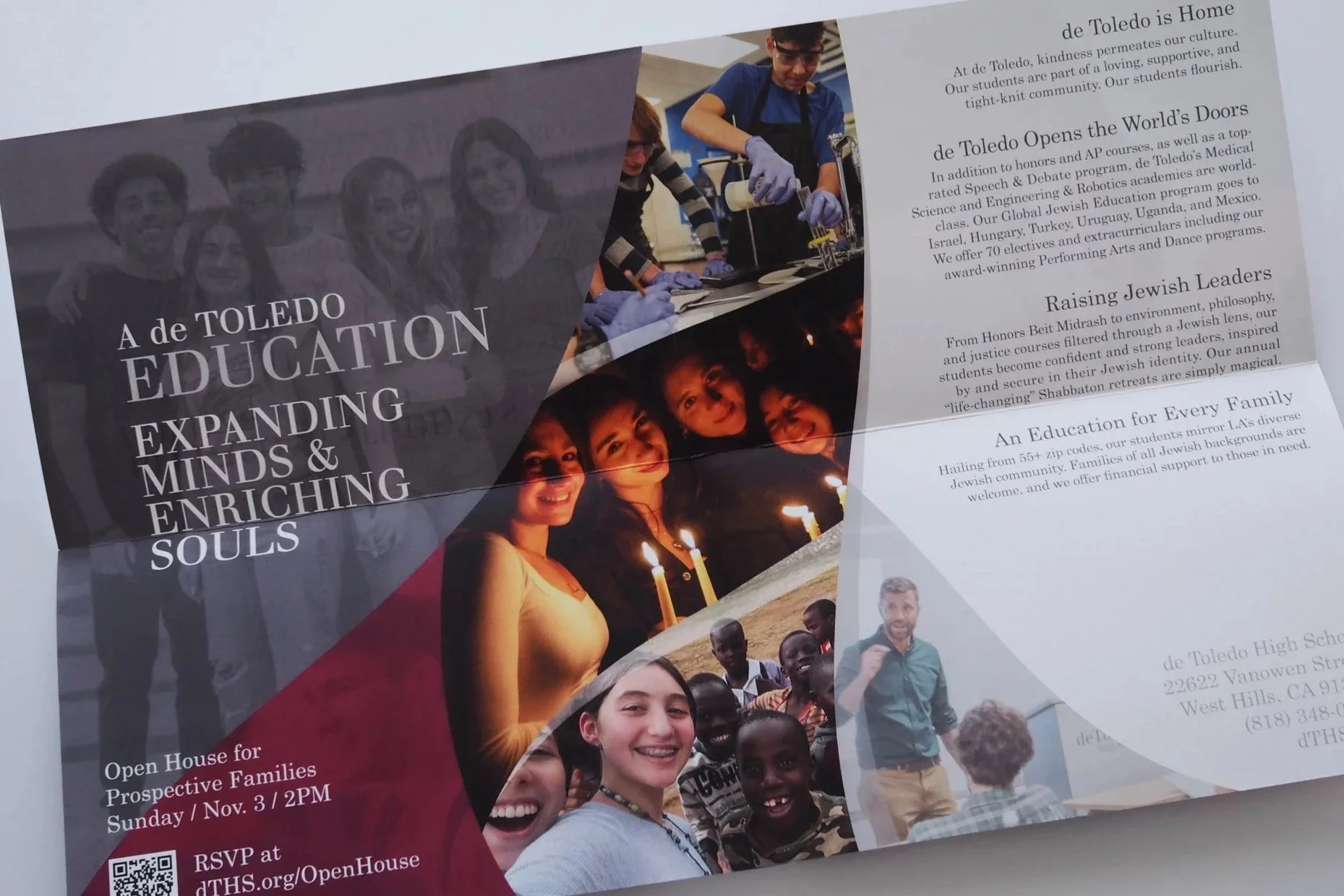
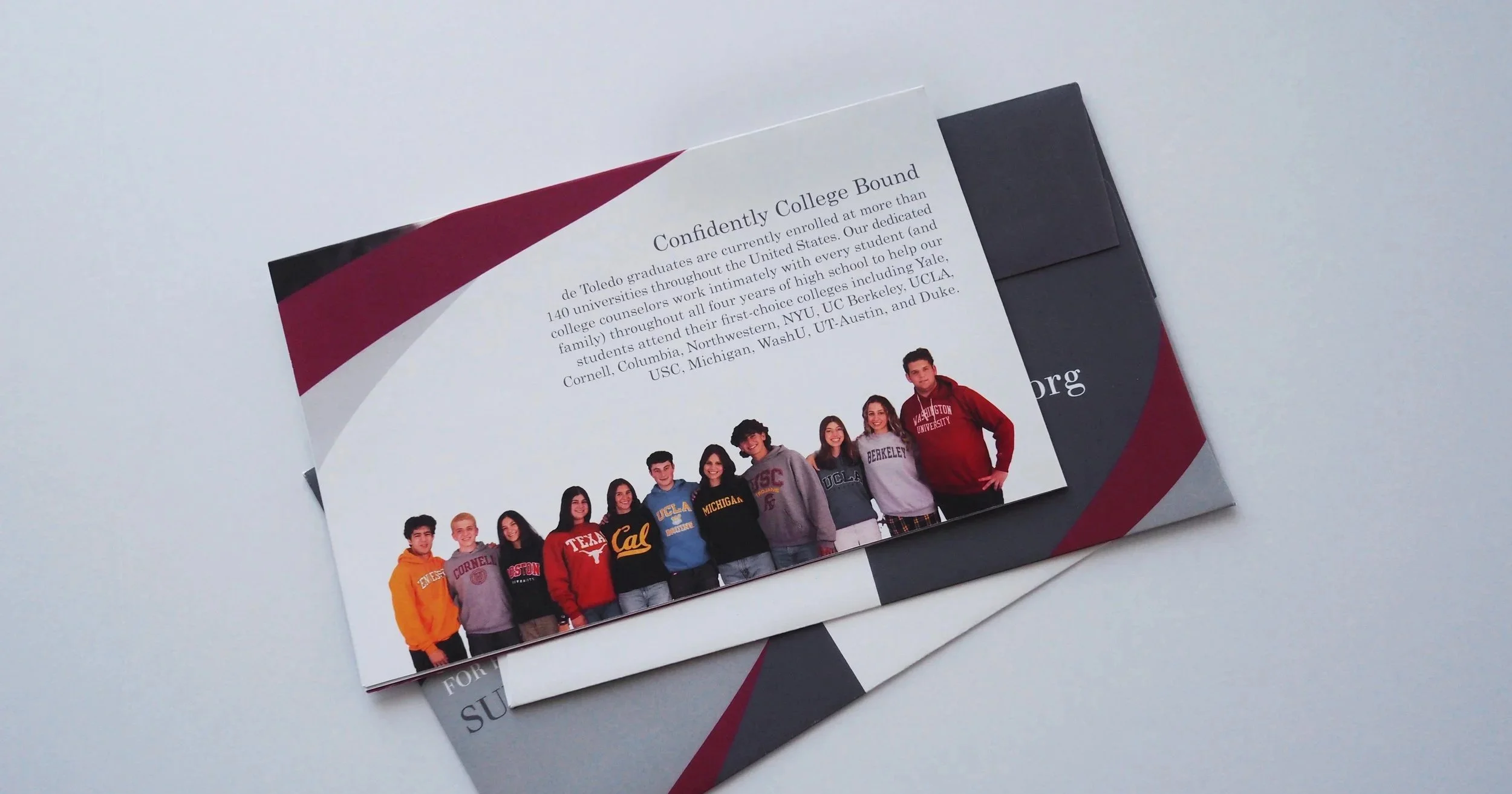
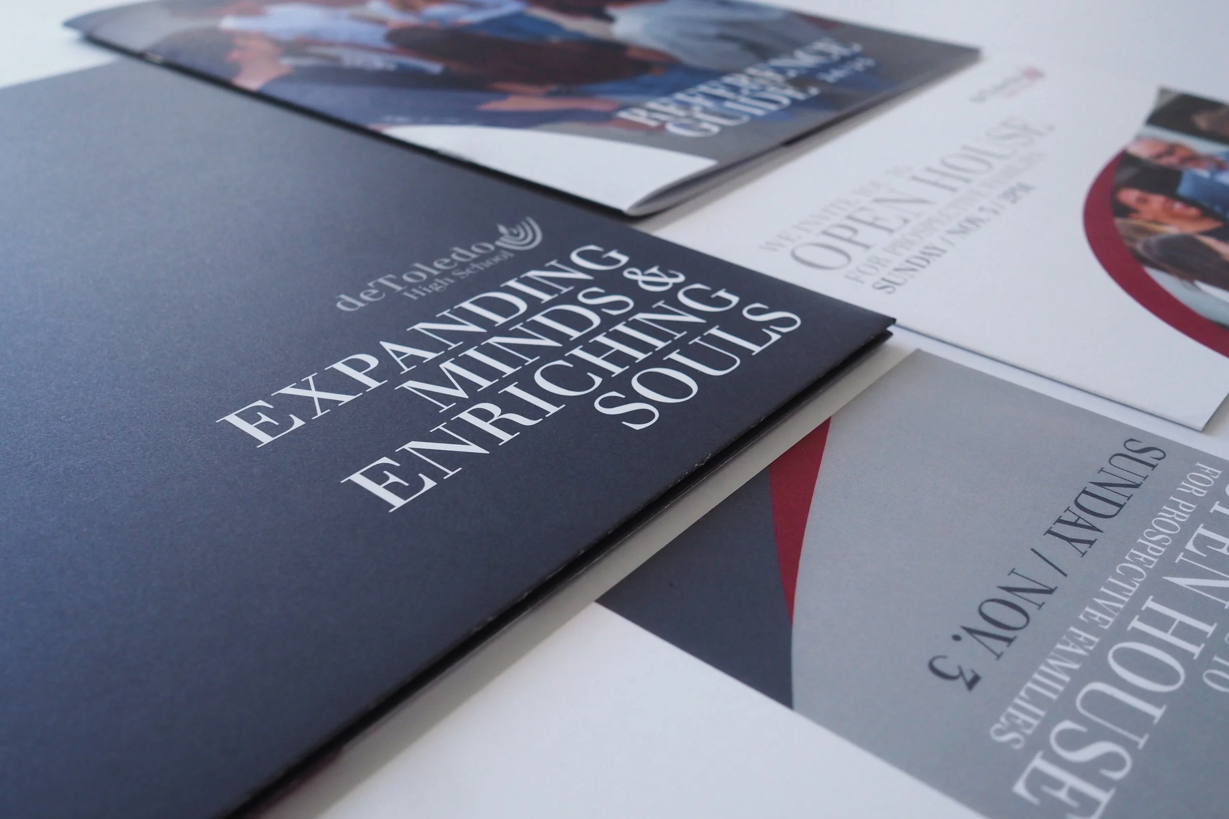
My first major opportunity to implement this system was the enrollment campaign, which included a reference guide book, a presentation folder, and an invitation to the school's Open House. The goal was to create materials that felt polished, memorable, and unmistakably “de Toledo”.
I also established a stronger typographic direction by consistently setting our primary typeface, Walbaum, in all caps. The result was a bolder, more refined look that reflected the school's academic excellence and its mission of preparing students for top universities.
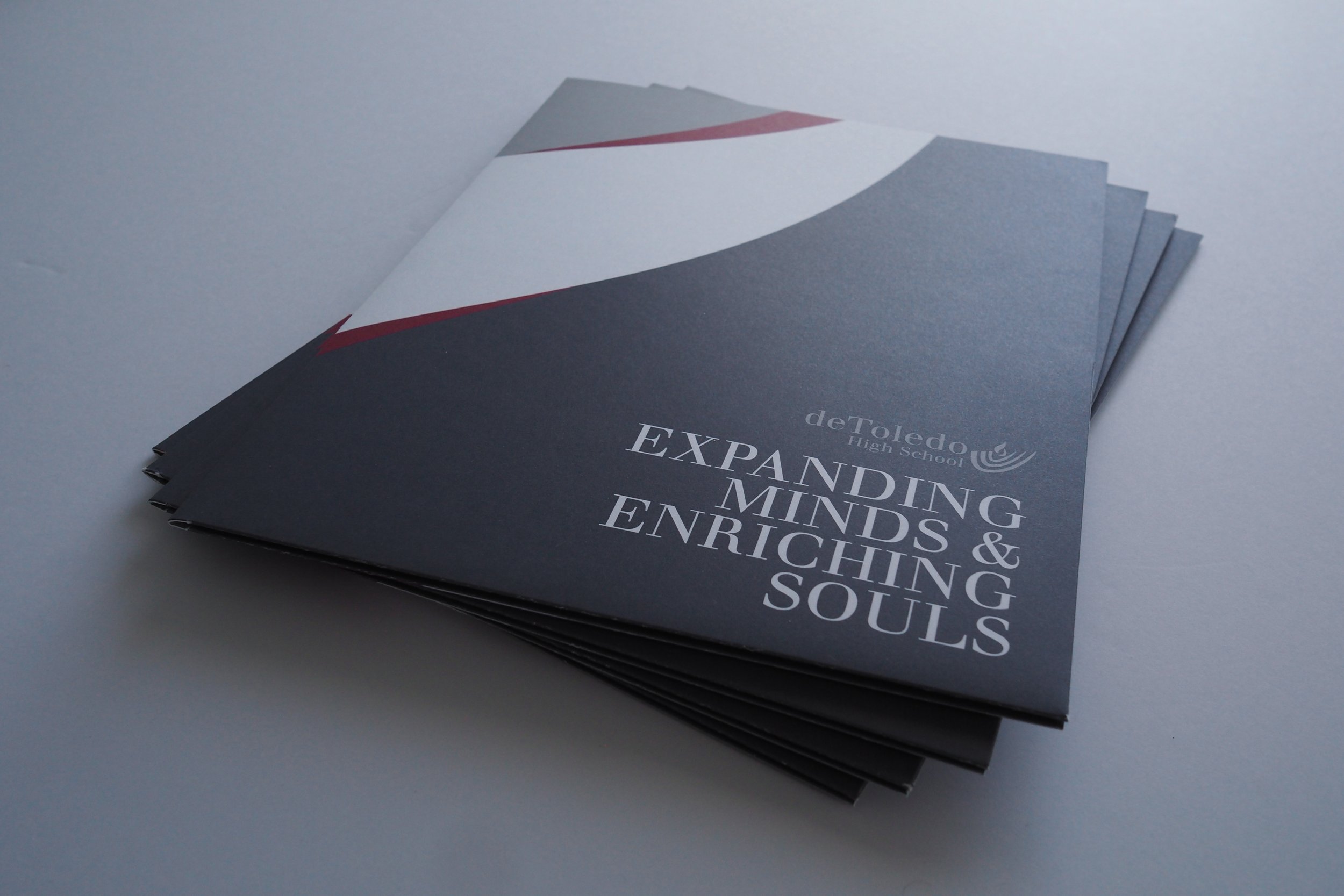
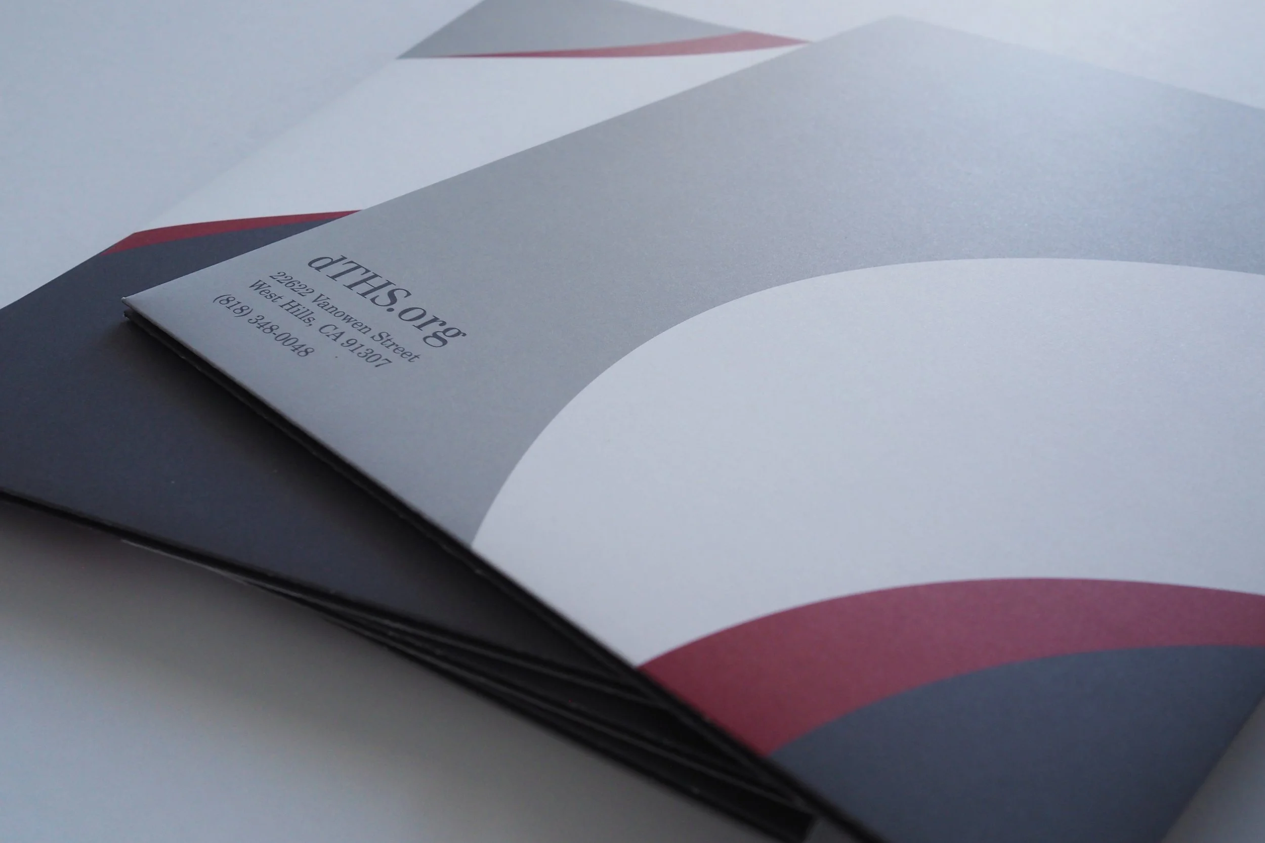
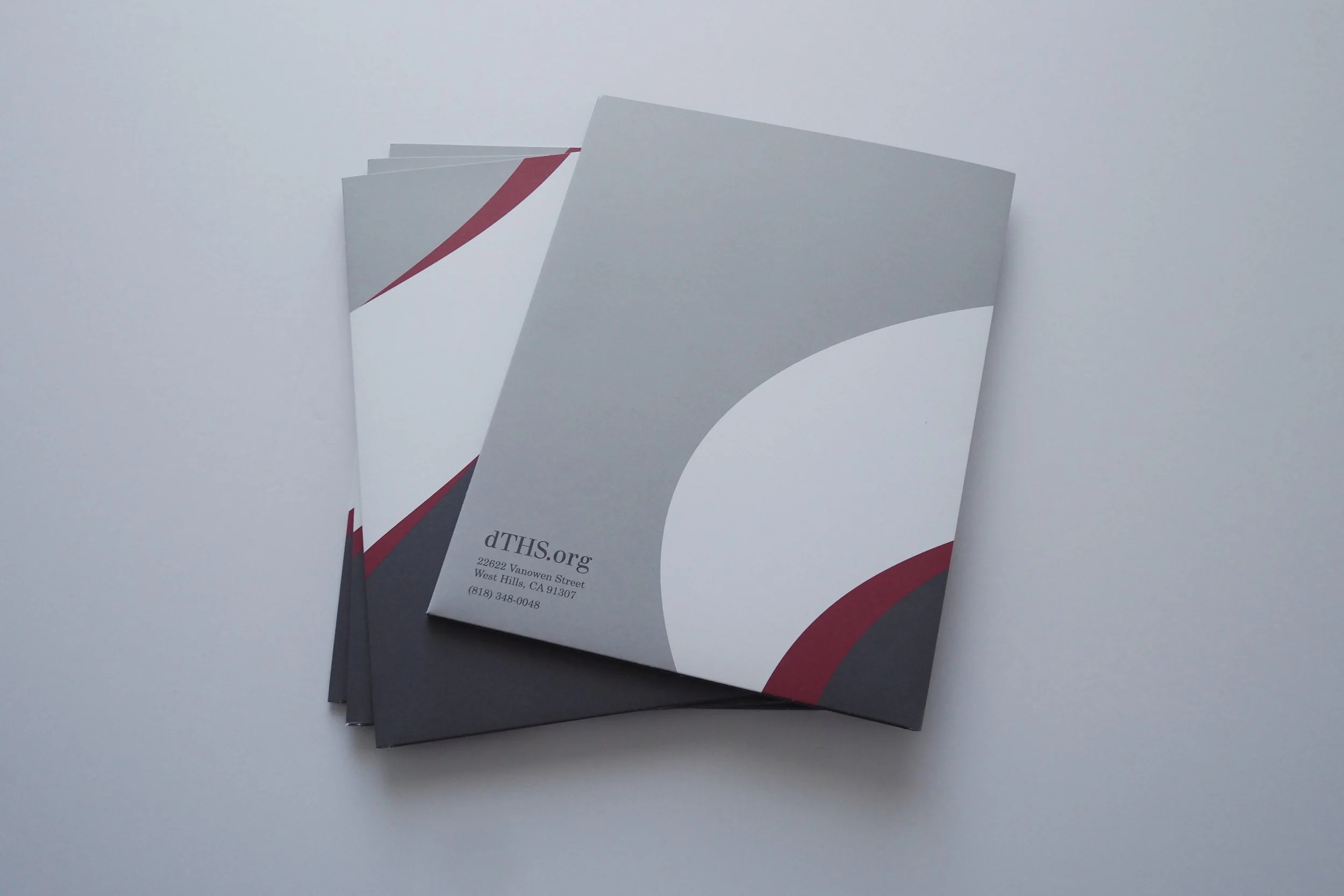
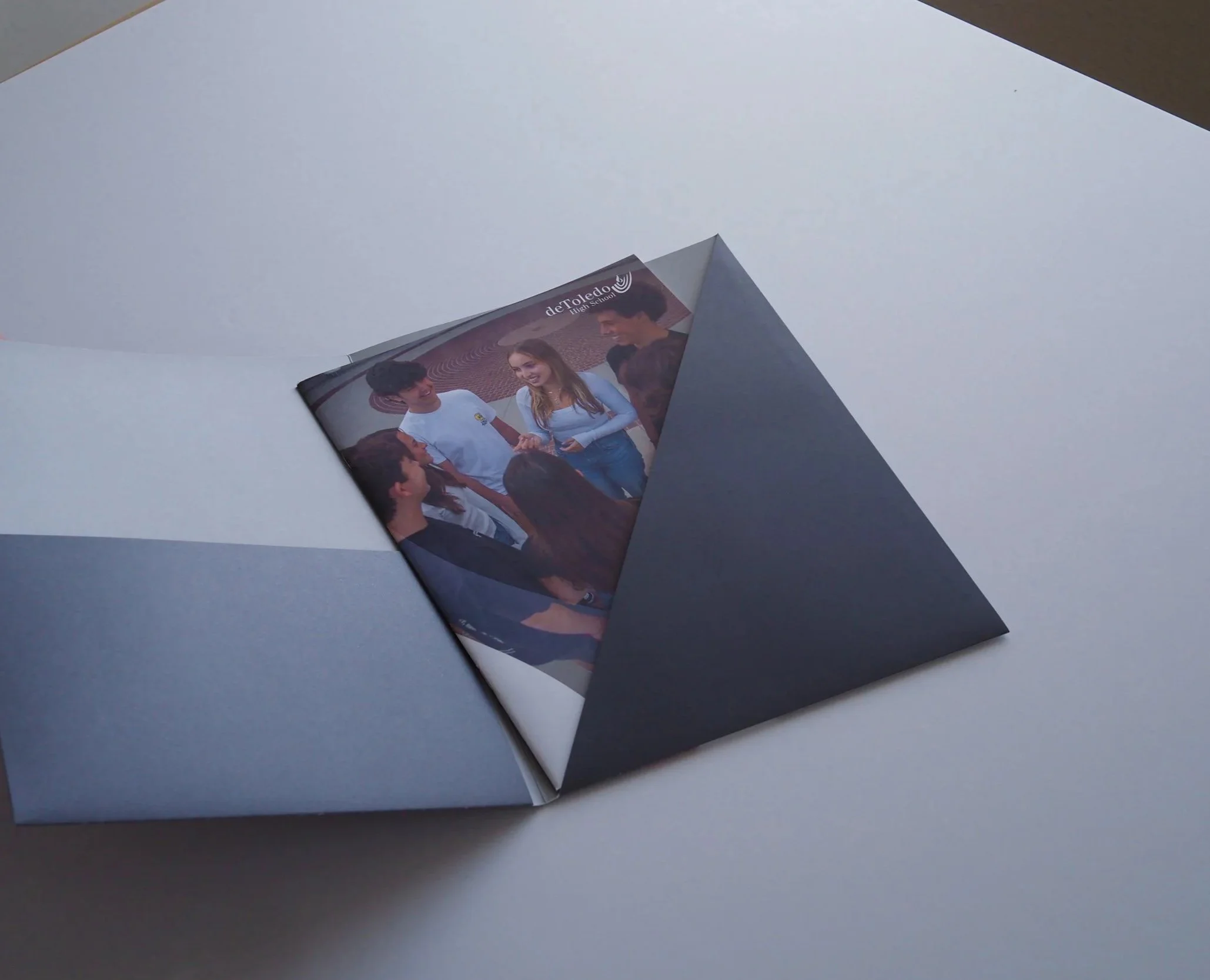
While burgundy remained the school's signature color, I shifted the focus of this campaign to silver and gray, using burgundy as an accent. This gave the materials a fresh, elevated feel while still remaining true to the school's established brand.